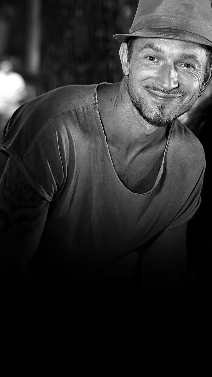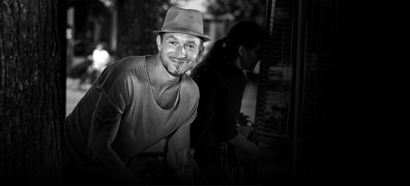


HELLO WORLD!
A strong logics behind design is what I like and believe yet with creative approach. I like to give users (whether UX or graphic lines) easy and comfortable feeling in complicated environment. Some say “less is more” can be a tag to put next to my profile.
And yes - deadlines are as important as graphic lines for me so professionalism is valued very high from me.
I’m experienced graphic and UX UI designer yet eager to learn new. With full commitment to my work and positive attitude I try to walk through life. With international work experience including UK & Middle East in multinational teams, I have gained knowledge in communication between different nationalities and cultures. Current residence - Denmark.
Aside from design, mountain biking is big part of my everyday now as it is perfect combination of two of my loves - sports and nature.
WORKING EXPERIENCE
Freelance 2006 -
Last few years mostly working with my clients, mostly Branding, web – UX/UI, packaging, adding clothing prints and from sketches to fully finalized projects to my case.
2017 - 2019
Sr Graphic designer
Magneet (Riga,Latvia)
Branding, logos, AD campaigns, prints. Webs – UX UI
2012 - 2014
Sr Graphic designer
IDEA ( ex EuroRSG Latvia)
Branding, logos, AD campaigns, prints. Webs – UX UI, packaging.
2009 - 2011
Sr Graphic designer
Gulfmarcom Oman (ex Saachi&Saachi) Musqat Oman
Branding, logos, AD campaigns, prints. Webs – UX UI
2007 - 2009
Sr Graphic designer
EuroRSG Latvia
Branding, logos, AD campaigns, prints. Webs – UX UI
2006 - 2007
Graphic designer
Brandbox (LV)
Brand identities. Logos.
2004 - 2005
New media and Graphic designer
Brackets corporate communications (Bahrain ME)
Graphic design for printing and new media projects,
Art directions for print campaigns. /clients – Almoayyed International group, Alzain, Elite Hotel, pubs and night clubs …/ Ux Ui for “Bahrain Centre of Studies and Research”
2002 - 2004
New media and Graphic designer
Media Center SIA (Latvia, Riga)
Graphic design for printing and new media projects
2000 - 2002
Jr Graphic designer
Authentic Industries Group Ltd (UK, Manchester) in house design.
* Brochures, posters, leaflets, packaging design
* Flash presentations, Web design
1999 - 2001
Jr Graphic designer
EOS SIA (Latvia, Riga)
Graphic design for printing media materials
(Pepsi, L'Oreal, National Car Rental, Volvo)
AWARDS
GRAPHIC design for restaurant Hospitalis was included in design book about restaurants around the world - published in Hong Kong.
EDUCATION
2001 - 2002
Manchester Metropolitan University
New Media Design foundation degree
1997 – 1999
Latvia's University / Finance management
1994 - 1997
Riga Hanza secondary school (Latvia)
1986 - 1993
Druva secondary school (Latvia)
LANGUEGE SKILLS
Latvian - Native
English - Fluent
Russian - Fluent
Danish - beginner level (in process - school)
German - begginer level
TOOLS
COMPUTING (MAC & PC)
Adobe Illustrator, Photoshop, In Design, Microsoft pack, Shopify, Wix and others
CONTATCTS
guntarsgravins@gmail.com
or social networks Fb & Insta
elementari.lv - visit>>
is the first meal kit service in Latvia
MISSION
to create a brand that helps people save time and money
on everyday cooking by offering good quality products and tasty
recepies with delivery at the door.
CHALLENGE
Name and logo has to include some important information about brand.
As the whole idea is that it should be very easy to cook in short
period of time and skip supermarkets. Elementari - elementary.
PRINTS
Recepies - they are made fool proof with a step by step instructions
so even a kid could cook a meal.
UX UI - Online shop
as there are a lot of sections and products
it has to be smartly categorized so the user can easy navigate and
understand site map. Client was so happy with the result he wanted to
register site navigation as a patent but wasn't possible at the time.
PACKAGING
simple and clean and cheap on costs which was very important so the
end product would be in comfortable price.
SOCIAL NETWORKS
Campaigns with influencers were created to introduce people with this
new service.
And various "call to action" ads.
This was the case when brand has a very good quality product but had
little attention on visual side of brand therefore was hard to reach
wider audience.
CHALENGE
To create logo that has to have that necessary japanese vibe but would
stand out and differs from others in market.
I created new logo with authentic type and to get that Japanese vibe
what was mising before I added anime characters to visuals and some
little story about boy who likes these sushi so much that he has to
get them unnoticed.
New visulas were added on fascade and other comunnication channels
SIMSONS
are wine lovers family and runs wine shop and cafe. And I can call
them my friends as well. They took it over from previous owners and
were in need of new everything.
We changed the name, logo, fascade of shop, created ad campaigns on social network and posters inside and outside of the shop.
Shop is loacted next to a church and was used as inspiration.
As owner is a fan of poems, books etc I offered her to translate
famous qoutes visually in result came out series of posters.
ABRENE
a concept for a beer producing company in Latvia!
MISSION
To create a beer brand that reflects a part of Latvia's history and
targets true latvian souls as Abrene is a small town - was part of
Latvia taken away by Russia.
CHALLENGE
To make it look latvian and traditional yet including injustice and
uplift the spirit.
LABEL
To include cereal grain was natural as it symbolizes rich an fertile
land and beer itself is produced from it. As bear is a symbol for
Russia and well known fact in Latvia, I created bear under cereal
(made looking small) walking away from land and Abrene.
Copy on label - my land my beer. Light and dark beer versions.
APPLE PAPA
Real spiced apple brandy / calvadoss crafted by well known Latvian
chef now working in Dubai under Heston Blumenthal.
MISSION
To create packaging that should deliver msg straight and clear whats
inside of the bottle yet it has to stand out on shelf from
competitors.
LABEL
As it is spiced with many spices I used spice graphics yet keeping all
in background using one color (brandy) in different tones and made
apple really stand out so it could be visible from distance and
delivers message straight and clear.
LOGOS
are one of my favorites to design yet they are one of most challenging. Logo is a small object that includes very important information about company or individual and comunicates rightly with customer. It has to differ from other competitors in market, easy to remeber and must include some values of company or individual.
Over the years I have created more then 70 approved and living logos.
ICONS
Icons are like logos but with less tasks to it yet they have to speak in graphic language and mostly are based on call to action. But they can be very challenging when it has to include several actions and values in one icon like ones used for large or small databasis.
HGK
are tone setters in world of drift car builders. You can build your
own drift car by online shopping as they trade all in parts.
ONLINE SHOP
It is built on shopify base with limited access on functions and
design.
visit - hgkshop.com
MISSION
Overlook: to make it look respectable and exclusive (as the product
itself it is) and highlight products therefore I used calm grey
background colors
CHALLENGE
All pictures were taken on site in workshop and needed a lot of
photoshop to make them look exclusive and important.
REBRANDING
As the logo is well known in drift world it can’t have completly
different look but it needed uplift and more dynamic look. And a
version dedicated to their most famous car Eurofighter.
HOODIE
As there are a lot of requests for it we created a hoodie from
sketches to a real product. A few tests have been made to get the
right quality. It is still in test production.
A lot more merchendise products will follow.
.
North Valley breast clinic is located in CA USA.
REBRANDING
A previous version logo was more revelant to beauty salon rather then
serious clinic with hi tech machines and med staff.
Medicine logos has some specific rules and client was happy to give it
more Europe look to it. Simple clean lines with letters b (breast) and
c (clinic) included.
As majority clients are women in collaboration with client we came up
with idea to include natural purple (brand color) flower patterns in
visual communication as it calms patients rather then old technical
pictures before. And real flowers were added to interior design.
aLorem ipsum dolor, sit amet consectetur adipisicing elit. Unde ipsam quidem dolore iusto fugiat quod, libero odit nobis placeat quo perferendis atque dolorem repellat fuga non dignissimos quae reprehenderit sint. Lorem ipsum dolor, sit amet consectetur adipisicing elit. Unde ipsam quidem dolore iusto fugiat quod, libero odit nobis placeat quo perferendis atque dolorem repellat fuga non dignissimos quae reprehenderit sint. Lorem ipsum dolor, sit amet consectetur adipisicing elit.